Connect with Your Supporters Using the 7 Elements of Nonprofit Email Design
For some, the hardest part of email marketing can be design.
Maybe you’re not sure what you want your emails to look like or maybe you’re having trouble determining where to put things.
Without the right design, it will certainly be harder to connect with your audience.
The truth is, your design doesn’t have to be complicated. You’ll want to keep it simple and easy to inspire your readers to take action.
Join us for a free webinar, Design an Eye-Catching Email Campaign for Your Nonprofit in 15 Minutes or Less
By using these 7 design elements, you’ll be creating emails like a design pro in no time!
1. Header
The header is not something that you typically think of as a design element. However, it is one of the most important because if people don’t even open your email, they won’t see your hard work.
There are 3 elements of the header that you need to use to make sure people want to open your email:
- From information
People need to feel like they trust you, the sender, before opening an email. Make sure the From Name and Email Address are easily recognizable to your supporters. Depending on their inbox, contacts will see one field or the other. For most organizations, the From Name will be the name of your nonprofit.On the other hand, some readers will see the From Email Address. We suggest using an address from your domain (@heartsandtails.org vs. @gmail.com) for best results.
- Reply email address
It’s important that your contacts be able to reply to your email. Make sure you use an official email address from your nonprofit organization and that someone is able to monitor the responses. You don’t want to miss an opportunity to connect with people who are willing to help.
- Subject line
Your subject line has to be catchy to entice them to open your email. Keep the subject line between four and seven words. Provide a brief explanation for what it’s about.

2. Preheader
The preheader text shows below or after the subject line within the reader’s inbox. Use this as an extension of your subject line to entice people to open the email and increase your open rates. We recommend using 5 to 8 words to catch their attention.
The subject line and the preheader text should work together to show contacts just enough information to get them to open the email.
3. Logo & colors
When your supporters open your email, it’s important they recognize your branding right away. That means you need to include your logo as well as your brand’s colors.
Your logo should be at the top left or center of your email. Make your logo clickable to your website so your contacts will be able to find any additional information they need.
Use your organization’s colors in the background, buttons, and fonts to make it fit your branding. This will keep your emails looking branded and professional to draw people into your message.

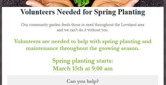
4. Image
Stats show that emails with 1 to 3 high-quality images result in more clicks.
When people open your email, they need to see an image that supports your message and draws them to your message. This image should inspire your supporters to continue reading.
If you’re not sure what kind of images to use, check out this post to capture compelling images for your nonprofit. You’ll find several ways to inspire supporters with your images.

5. Text
People are busy and if your email looks text-heavy, they’ll be less likely to read it.
Stats show that nonprofit organizations see the highest click rates for emails with 25 lines of text and membership organizations get the best results between 15 and 30 lines of text. Keep your email focused and easy to read with 1 topic per email for best results.
Your headline text should be at least 22 point font and the body text should be at least 14 point for the best readability.

6. Call to action
Every email should have a compelling call to action that helps you reach your goals.
Use action-oriented words on the button text and link it directly where they can complete the action you’re requesting. You don’t want them to have to try to figure out where you want them to go.
It’s always a good idea to send yourself a test so you can click the link and make sure it’s working properly.

7. Footer
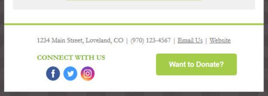
The footer of your email needs to show any necessary information for your contacts to get in touch with you.
You don’t want them to have to search for any information they may need to get in touch or support your organization. The footer should include:
- Location
- Phone number
- Email address
- Website
- Clickable social media icons
- Donate button

Using these 7 elements together will ensure greater success with your email design. These elements will keep your design simple, allowing your contacts to get the information they need to support your cause.
Get started today!


Comments
Post a Comment