
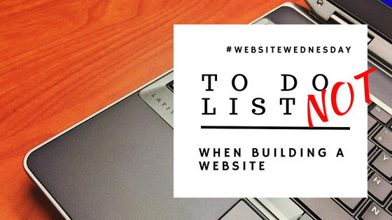
A To Do List (NOT) When Building a Website
When building websites there's a ton of great tips, tricks, and tools. There are also a few things placed in websites that can be either really annoying or aloof to the average consumer.
As a business owner, we need to continually re-align the wheels when it comes to marketing and that's where a marketing team or agency comes into play but for the small business owner or solopreneur, it's not always "in the budget" to hire or outsource for marketing. Thus, they do it themselves with one of the many awesome sites out there that are easy to use. The problem is many of the usual "homemade" website's features appear troublesome to regular consumers. Here's a small NOT to do list:
- Bad Color Schemes: Don't jump directly to your favorite colors. Choose colors that convey your message while speaking to your target audience. To view some unbelievable color schemes view this blog post from Sitepoint.
- Chaotic Background Videos: Initially this was an awesome idea. Something different & eye-catching but more thought needs to go into placing these videos into a website, such as clarity, connection speeds, file size, etc. Undullify has a few tips for using video on your website
- Overused Stock Images: Just make your own. No, seriously, just make your own. In the long run, it'll be better for your brand. There are some other annoyances about stock photos that you can read at WebMeUp
- Pop-ups & Sign-ups: I'm totally guilty of these because both are great list builders. I think it depends on your industry & your need but there are better ways to build your list. For me, the business needs to be transparent about the usage of the email obtained from the pop-ups & sign-ups but to understand more from the consumer side read this article from Unbounce
What are some of your favorite features that you include on your website, that encourages your ideal client or customer to click-through?

Comments
Post a Comment